Tutorial 8 Week 11
Colour
A. Practical Exercises
Activity 1: Creating Colour Palettes Using the Colour Wheel
Open up Color Scheme Designer in the Firefox browser (it wasn’t working in Internet Explorer the last time I tried). The URL is http://colorschemedesigner.com
Experiment with the different schemes (mono, complimentary etc). Move the hues around by dragging the spots on the color wheel.
Adjust saturation, brightness and/or contrast after selecting the ‘Adjust Scheme’ tab.
When you have a color scheme that you like - export it to HTML + CSS after selecting the ‘Scheme Info’ Tab.
Obtain
- a print screen of the exported page
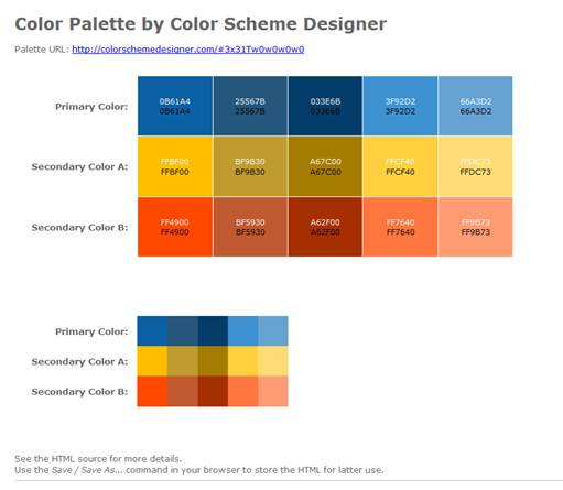
- the css code of the page (Hint- View the source of the HTML page)
to put on your Yola site.
/* Palette color codes */
/* Feel free to copy&paste color codes to your application */
.primary-1 { background-color: #0B61A4 }
.primary-2 { background-color: #25567B }
.primary-3 { background-color: #033E6B }
.primary-4 { background-color: #3F92D2 }
.primary-5 { background-color: #66A3D2 }
.secondary-a-1 { background-color: #FFBF00 }
.secondary-a-2 { background-color: #BF9B30 }
.secondary-a-3 { background-color: #A67C00 }
.secondary-a-4 { background-color: #FFCF40 }
.secondary-a-5 { background-color: #FFDC73 }
.secondary-b-1 { background-color: #FF4900 }
.secondary-b-2 { background-color: #BF5930 }
.secondary-b-3 { background-color: #A62F00 }
.secondary-b-4 { background-color: #FF7640 }
.secondary-b-5 { background-color: #FF9B73 }
/* end */
body {
margin:0; padding: 2em;
background:white;
color: #666;
font: 75%/1.33 Verdana, sans-serif;
text-align:left;
}
h1 {
margin: 0.5em 0;
font-size: 200%;
}
p {
margin: 0.5em 0;
}
.color-table {
margin: 2em 2em 5em;
border-collapse:collapse;
border:none;
border-spacing:0;
font-size:100%;
}
.color-table th {
padding: 0 1em 0 0;
text-align:right;
vertical-align: middle;
font-size:110%;
border: none;
}
.color-table td.sample {
width:8em; height:8em;
padding: 10px;
text-align:center;
vertical-align:middle;
font-size:90%;
border: 1px solid white;
}
.color-table.small td.sample {
width:4em; height:4em;
padding:0;
border:none;
}
.color-table .white { color:white }
.color-table .black { color:black }
hr {
border:none;
border-bottom:1px solid silver;
}
#footer {
padding:1em;
text-align:center;
font-size:80%;
}
At the bottom right you will find a drop down box titled ‘Simulate color vision deficiency:’ Select some of the various forms to see what the colors would appear like to a person with that particular form of color blindness. (We are going to use another simulator later on).
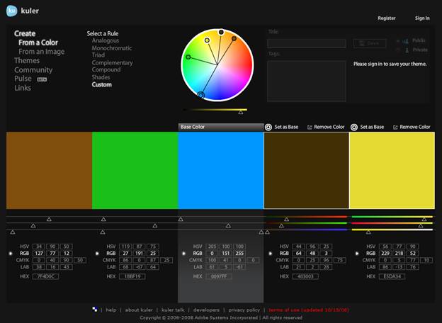
Open up the Adobe Kuler tool at http://kuler.adobe.com/#create/fromacolor
Again, experiment with the various schemes (called rules in Kuler) and try dragging the spots on the color wheel around.
When you have created a palette that you like obtain a print screen to post on your Yola site.
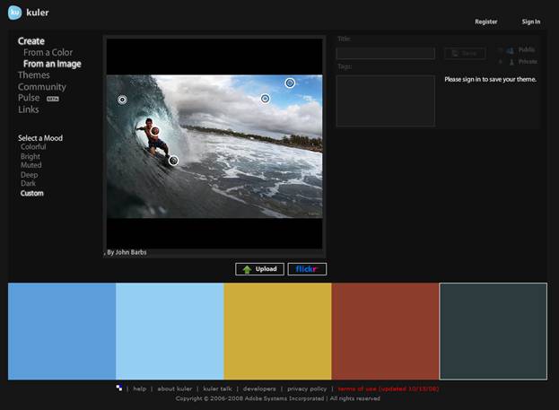
Activity 2: Creating Colour Palettes Using Images
Open up the Adobe Kuler tool to create a palette using an image http://kuler.adobe.com/#create/fromanimage
Click on the flickr button to choose an image from flickr. Experiment with the different ‘moods’ and by moving the spots on the image to different places.
When you have created a palette that you like obtain a print screen to post on your Yola site.
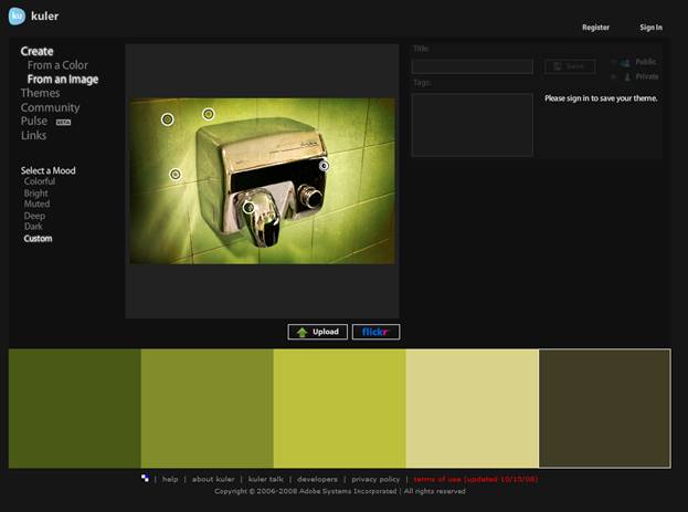
Repeat the above using one of your own images that you have uploaded
When you have created a palette that you like obtain a print screen to post on your Yola site.
Activity 3: Colour blindness Simulation
Web designers need to be careful because a certain percentage of the population has color blindness. Use the Coblis simulator to see how an image that you upload looks with various forms of color blindness.
http://www.colblindor.com/coblis-color-blindness-simulator
Write a paragraph describing what you find and the implications this might have for web designers.
(Just for fun – try out Tiny Eyes which simulates what images to look like for infants at various stages up to 6 months http://tinyeyes.com/tryit2.php )
Web designers design for the eye. They try and make a web-site kinaesthetically pleasing for the eye. With the different colour blindness you can see how this makes the job of a web designer a lot harder. Some designers use bold colours to attract the eye. A person with colour blindness might lose these bold colours; they might not see them as bold. In fact some colours can change so much that they can look like another. This leads to the designer having to pick good colour schemes to accommodate the types of colour blindness, and to help prevent this similar appearance; to achieve contrast among the colours they use.
I was surprised that some colour blindness types is not completely colour blind, but can just lose saturation. I was also surprised that some colours actually change colour to a certain degree. A colour that looks bright orange to me could look light red to a person with Tritanopy.
Activity 4:Font Colours
Use the Back to Font tool at http://markup.co.nz/colorpicker/back_to_font.htm
With the body tag selected, experiment by changing the font color, background and other properties.
Find a combination that you
- like
- would not recommend
and copy and paste the resulting CSS code (in the top right corner) for each of these into your Yola site. Make sure you label which is the one you like and which the one you would not recommend.
Find the CSS code for the following –
H2 tag
Color: royalblue
Background: ghostwhite
fontFamily: Arial, Helvetica, sans-serif
Copy and paste this code in your Yola site.

B. Independent Exercise
Independent Activity 1: Research into Colour
Using the Research-Based Web Design & Usability Guidelines you downloaded in Week 2 -http://usability.gov/pdfs/guidelines_book.pdf
Answer the following questions about the use of color on the web, based on the research evidence (hint – you can search on ‘Color’)
Why should you not use color alone to convey information?
You shouldn’t use colour alone to convey information as 8% males and 0.5% females cannot discriminate colour. This causes these individuals to lose the information or have difficult drawing meaning from the information.
How can color be used to provide feedback on users’ location?
The usual colour of a hyperlink on a web-page is blue. Changing this colour when a link is active or has been visited, allows the user to see where they have navigated to and also their location. For instance if the current page they are on has a link to the current page, that link will be a different colour to signify to the user that they are currently on that page.
What is the best color for links and to designate used links?
The best colour to show unvisited links in is blue. The reason for this is because the blue link is the standard colour for links, and in 2002 a study showed that 35% of people showed compliance to the blue link. For visited links the colour is purple, this goes the same with an unvisited link. People see a purple link and automatically believe that they have visited that link before.
How can you use color to provide grouping and help users understand what does and does not go together?
There are many ways to signify that certain elements belong to a certain group. One way is to make elements the same colour, or just making the background of the elements the same colour. This allows individuals to see the contrast from other elements and understand that these elements have something in common. People can distinguish up to ten groups by using 10 different colours. It is safer though, to use up to five colours. If more than ten colours are used then the relationships between elements will be lost.
Independent Activity 2: Culture and Colour
If you use color on your Web site, then you should be aware of how your audience views those colors. This is especially important if you are designing a site that is intended for an audience of a different culture than your own (or a global audience). The cultural basis for color symbolism can be very powerful, and if you don't understand what you're saying with your colors, you can make big mistakes.
Visit the following website http://webdesign.about.com/od/color/a/bl_colorculture.htm
to help you answer the following questions –
- If you were to design a Wedding site intended for an Asian audience and you used a lot of white color, why might you be disturbing the people you're trying to reach?
The colour white in Asia signifies death. The colour will be the opposite of what your normal culture would be.
- Do you think that any eastern brides (eg. from China) wear white? Why do you think this is so?
Some eastern brides where white as they have had some western influence while they are growing up. White in a Western society means brides, angel, good guys, peace etc.
- Which colors would you use for a website with information on
- Saint Patrick's Day?
If the audience is entirely western then you would use the colour green. The colour green signifies new birth, spring and of course Saint Patrick’s Day
- Halloween?
If the audience is entirely western then you would use black and orange, black representing death, and orange representing creativity and autumn.
Read http://webdesign.about.com/od/color/a/aa072604.htm to answer the following question –
- What factors, other than culture, might influence a persons color preferences?
There are many factors that can influence how an individual perceives colours, for instance age; the younger population likes solid colours with the older population like more pastels. Class difference can also change colour preference in some individuals, for example, individuals who aren’t as educated like colours they know well such as blue and red, where well educated people like more obscure colours, such as taupe and azure. Males and Females have different preferences as well. Males tend to like cooler colours like blue and greens, where women like warmer colours such as red and orange. Finally a colour preference can be from marketing and what is trendy at that particular point in time.